True Favorites
These are the films that I’ve watched more than once (and in the case of Amelie and The Boxtrolls, watched more than ten times) and am consequently certain of their places in my all-star lineup. These are the movies that held up over multiple viewings, and in some cases, have even improved.
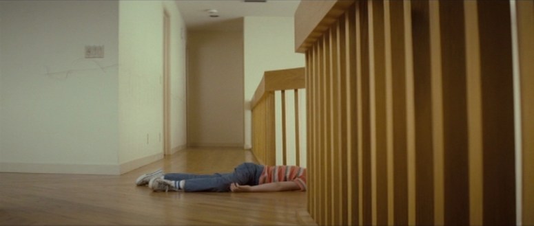
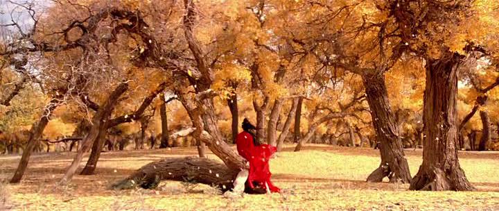
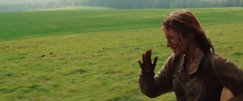
The Fall
Concept: A young immigrant girl is bored at a hospital and befriends an injured stuntman. He tells her a story to help pass the time, and we see that story through the lens of her vivid imagination.

Why I love it: This is my number one favorite film. Everything gets a little murky after this, with no discernible order to the favorites, and they often shift rank based on my mood– but this is a clear cut and unquestionable first place. The Fall has an impeccable storyline with small Easter eggs noticeable on second and third viewings. The cinematography is breathtaking and the costuming is stunning. There is an inventive narrative approach, largely thanks to utilizing the lens of the MC’s imagination, and the characterization that progresses throughout the film is impressive as can be. If you haven’t watched this film yet, then you are really and truly missing out.
Carol
Concept: Based on Patricia Highsmith’s 1952 book The Price of Salt, the film follows the story of a salesgirl who meets an older woman around the Christmas season. Hardships ensue as their relationship becomes more intimate and subsequently, more elicit.
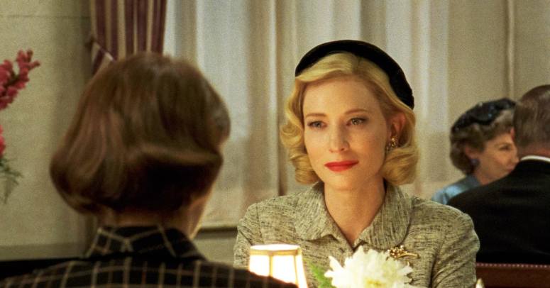
Why I love it: In my opinion, this film excelled in a lot of the places that Blue is the Warmest Color fell short for me. (Stay tuned for an upcoming post that will discuss the male gaze in film!) The chemistry is quietly powerful and it lends a simmering undercurrent of tension to the entire viewing. The film also showcases one of my all-time favorite uses of color theory. I’m hoping to share a full post about how it does so in the future, so for now I’ll just say that color plays as important of a role as any of the characters do. Carol is one of my favorite adaptions as well, and you can read more of my thoughts on that transition here. And last but not least, Cate Blanchett is the light of my life.
Léon: The Professional
Concept: After the death of her family, a young girl is taken in by a middle-aged assassin. Their relationship is somehow simultaneously complicated and simple, but as the story progresses, things become less clear-cut.
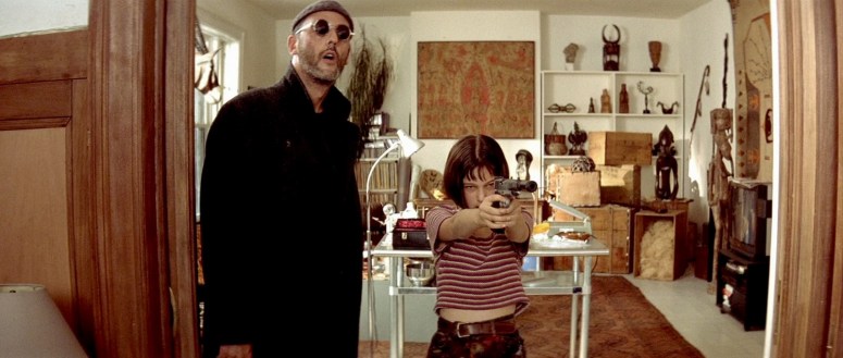
Why I love it: Honestly, I think this is a film that shouldn’t work but it somehow does. Twelve-year old Natalie Portman stuns in her first ever feature film, especially given the subject matter. What makes this film one of my favorites is the way quiet interactions take on so much meaning within the scope of this super off the wall scenario. Nothing about the situation is normal, but somehow that allows the humanity to take center stage. It’s a brilliant bit of story telling, and one that tugs on my heartstrings every single time I watch it.
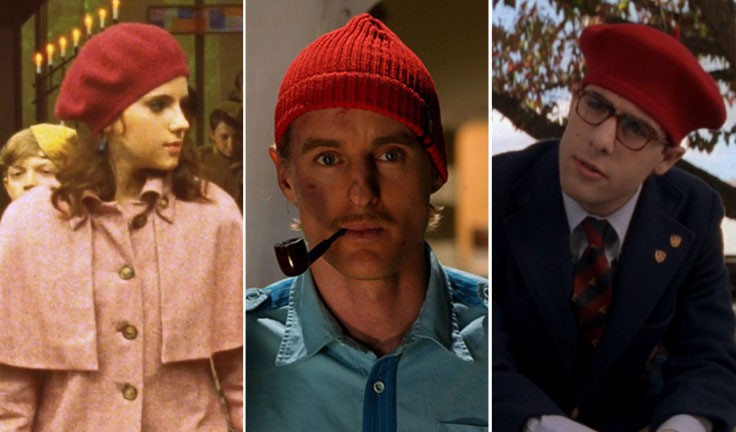
The Royal Tenenbaums
Concept: A dysfunctional family undergoes an exceptionally dysfunctional and challenging period in their lives as their patriarch attempts to insert himself back into their lives.
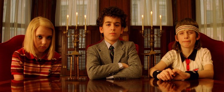
Why I love it: I think everyone has a favorite Wes Anderson film. It’s hard not to. His aesthetics are magnificent and his characters are all so unique, and this film is no exception. As much as I adore Rushmore and Moonrise Kingdom, The Royal Tenenbaums will always hold a very special place in my heart. Something about the arrested development and extensive cast of characters (and the dalmatian mice, obviously) just connects with me. I once wrote an entire paper for a college course about the movie and it’s the only Anderson film I own on DVD.
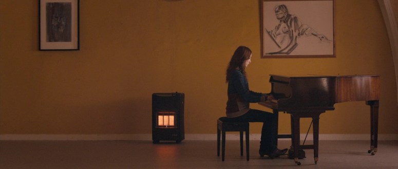
Butter
Concept: A young girl in the foster care system finds an unexpected passion in carving butter. She ends up rivaling the area’s most headstrong southern belle in a regional butter sculpture competition.
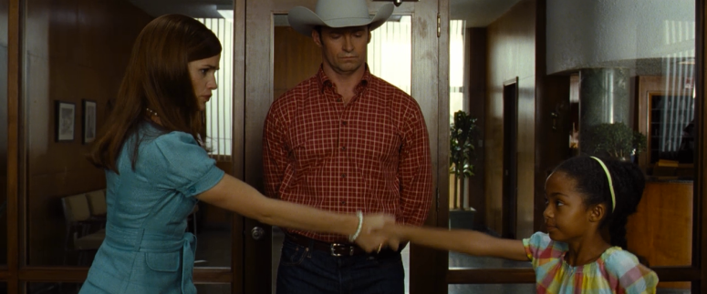
Why I love it: I grew up in Texas, and remember all too well the massive butter sculptures at the state fair every year (one year there was a life-sized cowboy on horseback). This film fills that very specific setting with an amazing cast: Jennifer Garner, Hugh Jackman, Oliva Wilde, and Ty Burrell. If there’s anyone I love more than Cate Blanchett, it’s Oliva Wilde. Each character has a huge personality, and somehow they all manage to mesh seamlessly with each other. It’s a very specific style of humor– it’s weird and satirical and sarcastic, and it’s quite possible that this is my very favorite comedy to date.
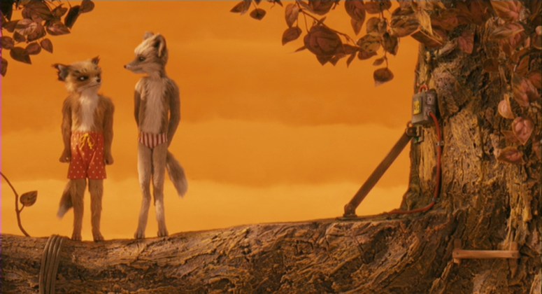
The Boxtrolls
Concept: An orphan boy is raised by a small group of agoraphobic trolls who collect trash. They live underground and are being hunted to extinction due to a campaign of fear and propaganda from the evil exterminator. Also, cheese.
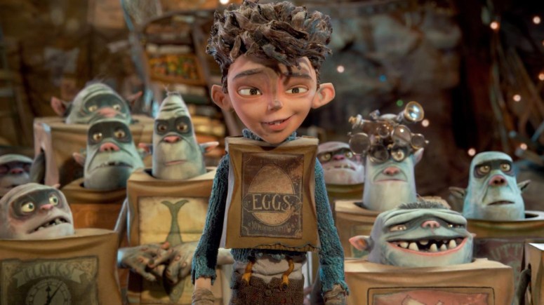
Why I love it: It’s no secret that I love a well-executed animated film, and I think I love this one most of all. I’ve seen this feature more times than any other movie in the world, and each time it charms me in new ways. It’s witty and imaginative, and amusing without feeling trite. In a world of animated movies like Trolls and The Emoji Movie, which tend to leave plot and characterization by the wayside, Boxtrolls is a blissful haven. The cast of voice actors is sublime (especially considering Elle Fanning’s most recent voice work in Leap! left much to be desired) and the animation itself is perfectly suited to the subject matter.
Runner-ups: Amelie, Rise of the Guardians, and Cry-Baby
One of the Good Ones
These are the films that I have only watched once thus far, but that really connected with me in the first viewing. Although they struck me as sublime upon that initial viewing, I would require a re-watch to be really certain.
Paris is Burning
Concept: A documentary following the lives of the people who were largely responsible for the birth of the drag scene in the 1980s. It focuses on balls, voguing and “the ambitions and dreams of those who gave the era its warmth and vitality.”
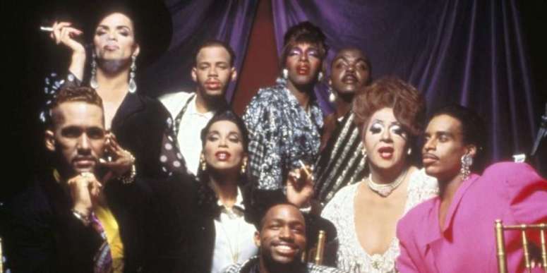
Why I love it: I went through a very brief documentary phase early last year, and out of the dozen I watched, this was the only one that really connected with me. It is heartbreaking in its honesty, and there is a tangible sense of both hope and fear throughout the entire film. It is beautifully composed, but more importantly, it tells such imperative stories, both on a cultural and individual level.
Hunt for the Wilderpeople
Concept: A young boy in the foster care system gets his last chance with an older couple living in the New Zealand bush. Shenanigans (and a national manhunt) ensue.
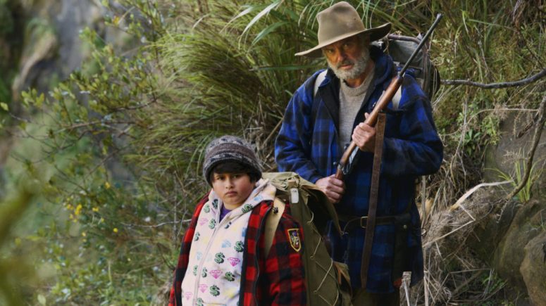
Why I love it: I should probably preface this with saying that I adore Taika Watiti. I was introduced to him via What We Do in the Shadows, and only became further enamored with him during the course of the Team Thor shorts that were released during the Captain America: Civil War marketing campaign. I’m definitely late to the Hunt for the Wilderpeople party, having just watched it last month. But boy oh boy did it blow me away– I think I experienced the full range of human emotion throughout the hour and a half viewing time. Watiti somehow manages to meld his quirky humor with a deep sense of humanity for a story that is poignant and enjoyable.
The Handmaiden
Concept: A Japanese heiress is being courted by a conman. She has a mysterious uncle. That’s all I’m going to say because it’s a far more enjoyable viewing if you don’t know the storyline.
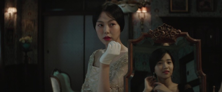
Why I love it: Plot twists abound! It’s not very often that I come across a plot twist that fully catches me off guard, but this story kept me guessing at every turn. Chan-wook Park did a brilliant job in approaching the multiple POVs, and each of the three acts brings a new perspective to what you thought you knew. In addition, every frame is visually stunning, as are the costumes. I can’t wait to watch this a second time and see what hidden things I pick up on now that I know the storyline. This isn’t like any love story you’ve seen before.
Runner-ups: Captain Fantastic, What We Do in the Shadows, The Longest Week


_67 (1)")