


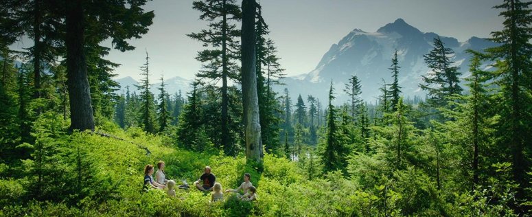
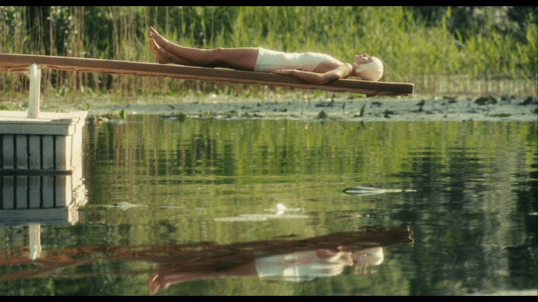
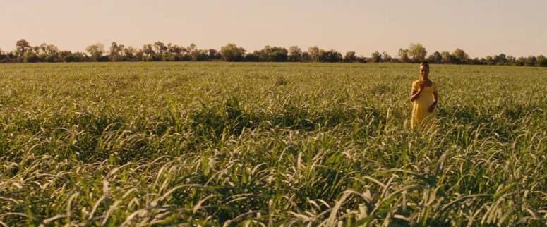
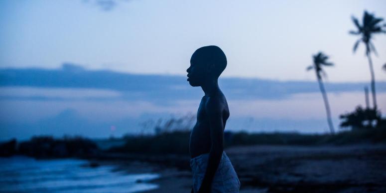
And we’re back! I was hoping to share an official post about color in film before starting a second round of color-themed cinematography posts, but hopefully it’ll be coming along soon! (It’s one I’ve been planning for a long time.) In the meantime, enjoy this batch of green frames!


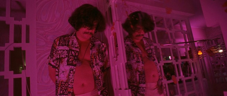
It’s funny how once you’ve noticed something, you start seeing it more and more frequently. I really loved the below frame from La La Land, featuring a focused pink neon glow over a club entry. After seeing that frame, I started to notice more frames featuring that dreamy pink glow. Here are some of my favorites!


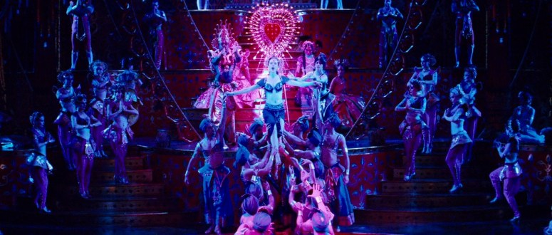
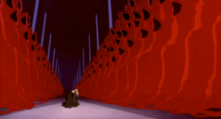
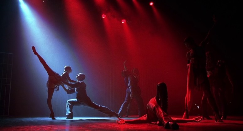
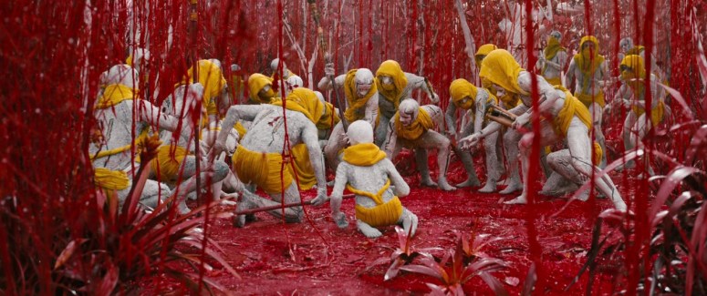
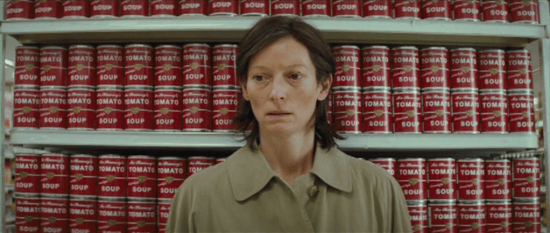
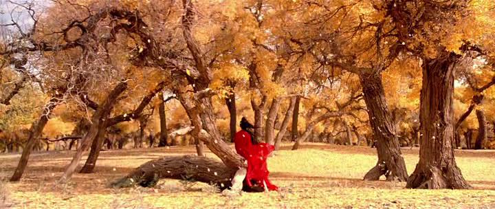
I’ve talked about the color red before, in regards to Tarantino and Anderson‘s use of it to drive home drama and importance. It’s an intense color that is visceral in a way no other color is. I’ve arranged these frames in order of presence/intensity, but I think all of them utilize the various shades in an amazing way. Enjoy!


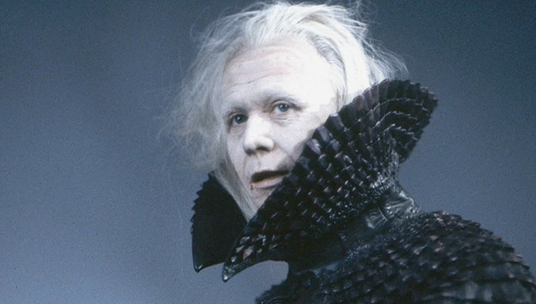
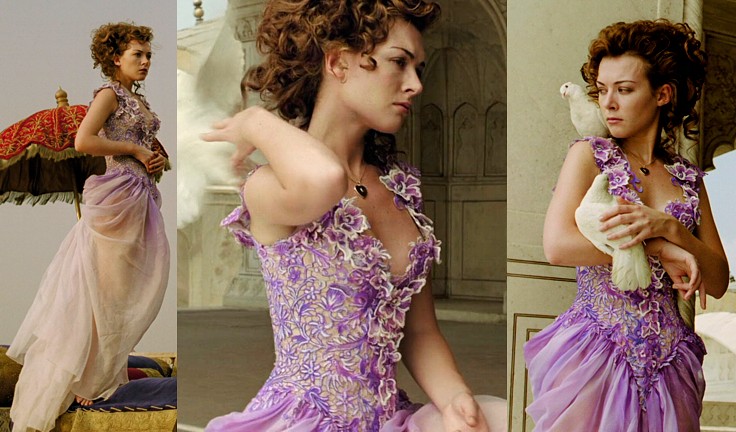
Japanese art director and costume designer Eiko Ishioka was virtually unparalleled when it comes to the amount of detail and excess that she put into her work. Anyone who knows me can attest to the fact that I love opulence and decadence in a film. It’s one of the reasons Baz Luhrmann is one of my favorite directors, and I can’t help but wonder what one of his films would have looked like if Eiko had designed the costumes for it.
Today marks six years since her death, so I wanted to take a quick minute to highlight some of her spectacular costume designs.
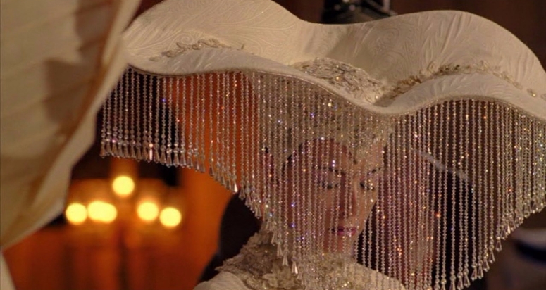
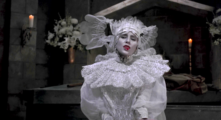
Her costumes were over the top in the very best of ways, always featuring an extraordinary attention to detail, as well as combinations that most designers wouldn’t even think to attempt.
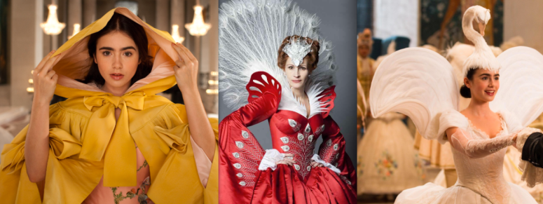
Eiko had the ability to maximize the potential of ordinary objects of clothing. Whether it was by elevating a hood to an item of mystique and wonder or turning a simple black collar into a work of art or, she had the magic touch.
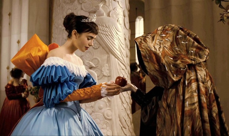
It was a mark of her genius that she was able to create two wedding dresses for two different movies that could not have been less alike. The inventiveness and ingenuity that went into both gowns is a thing of wonder.


Her ability to work with colors across the spectrum and combine them to create works of art is something that is rarely seen, especially on the scale of grandeur that Eiko utilized.
I find her to be the most talented designer of our time, and the film world is a less beautiful place without her.


I haven’t published a post about it yet, but as I mentioned in a previous post (and in just about every other place on this blog), I absolutely adore color in film. I love seeing how it functions as a plot device and how it sends subtle messages about what is happening onscreen. Color sets moods and drops hints and amps up aesthetics. To pay homage to my love for color in film, I’m kicking off a series of posts all about certain colors in certain frames. I won’t be talking much in these posts, but rather just letting the stills speak for themselves.
So without further ado, here’s seven shades of green.


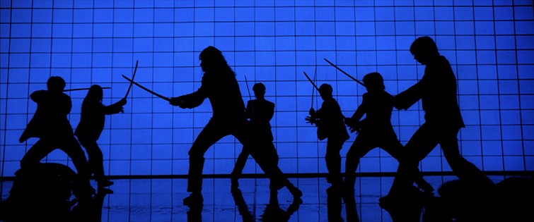
Prompted by: Kill Bill: Vol 1
I’ll never forget the day I watched both volumes of Kill Bill and Moonrise Kingdom in the same night. I was introduced to Tarantino at an earlier age than I was Anderson, and have always been partial to Anderson due to my own affection for whimsy and quirkiness. But for some reason, I never made the connections between the stylistic choices of the two directors until the day I accidentally watched their films back to back.
The colors that Anderson and Tarantino use are completely different, as are the moods they achieve with those colors. But both of them utilize color, both in entire palates and in specific spots, with a dedication that is not often seen. The thing about using color in film is that it isn’t always something viewers consciously pick up on (expect to see more on this in an upcoming post about color in film). The psychology of colors is a complex and extensive field of discussion, and there is no doubt that colors can both subtly and massively impact moods and feelings. Successfully utilizing certain colors to set certain moods is quite possibly one of the most clever ways to evoke feelings in film.
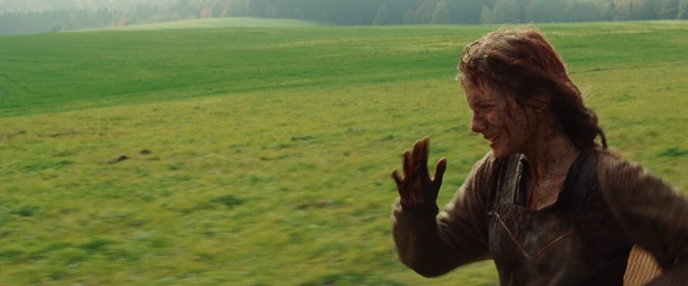
Tarantino uses primary colors such as red and blue in bold hues and cool tones to create emphasis on certain characters and contribute to the intensity of certain scenes. An excellent example of this is the use of the color red with Shosanna in Inglorious Basterds. When we first see her, she is running away with splashes of dark red blood on her face.
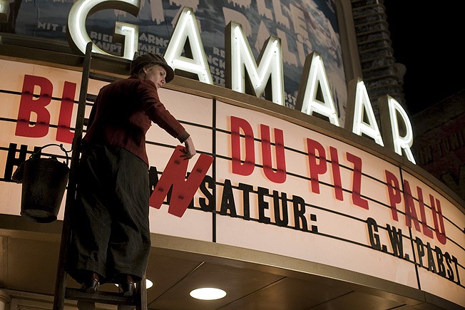
When we see her next, she is working on the marquis for her theater. There are bold red letters in the background and she is wearing a muted red jacket.
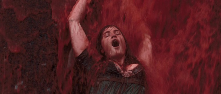
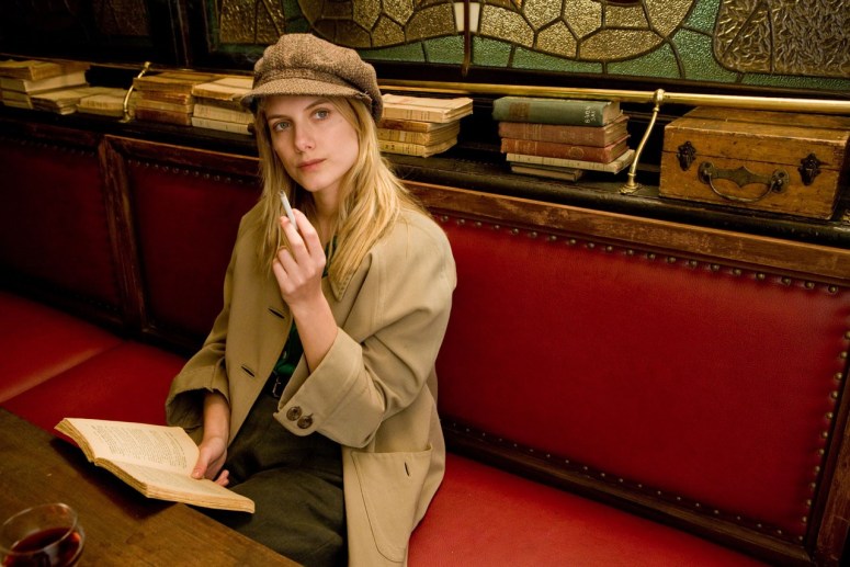
Her next scene features red as a significantly more dominant color: she is sitting in a bright red cafe booth and is surrounded by a vibrant shade of red.
And by the time we finally arrive at her climactic scene, she is draped, garbed, and surrounded by red.

The use of such a visceral and unavoidable color to slowly develop an incredibly strong and driven character is unmistakable. Tarantino’s most frequent use of red is with blood, but he often utilizes the color to evoke feelings of passion, violence, revenge, and intensity. Red is also known to enhance attention, both by drawing the eye to the color and by triggering certain feelings in the viewer. In the case of Shosanna, this works to drop increasingly more obvious hints that ‘this character is important, pay attention when she’s on screen.’
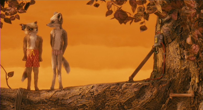
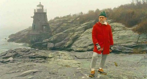
Anderson, on the other hand, uses it more often as an aesthetic focal point, while still hinting that something important is happening. An excellent example of this is with the narrator in Moonrise Kingdom. He’s simply talking about the weather, which is a very easy thing to zone out for. But by dressing him in a bright red coat and placing him in relatively colorless scenes, it helps the viewer to pay a bit more attention. Of course, anyone who has seen Moonrise Kingdom knows that the weather turns out to be a rather pivotal aspect of the entire storyline.
A similar effect is achieved through the coloring of the tracksuits in The Royal Tenenbaums. It is impossible to not be drawn to those fire-engine-red outfits, which again hints that this is something important and the viewer should take note. In this case, it is quite possibly the clearest indicator of the arrested development that the three children experienced.

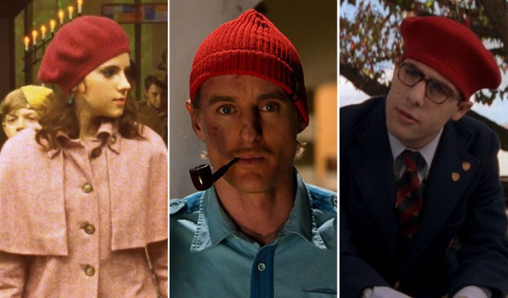
Anderson also plays up the passionate nature of the color red, using it to illustrate longing and deep desire, usually for affection. We can see this through the simple act of putting red hats on Suzy, Ned, and Max– all of which are desperate for the love of someone who is inaccessible in one way or another.
Over the years, Anderson has become known for his symmetry, and it is undoubtedly one of the primary characteristics of his stylistic choices. Tarantino seems to be a bit more partial to asymmetry, often choosing to follow the rule of thirds and offsetting a character to one side of the frame.
When I was watching Moonrise Kingdom minutes after finishing both Kill Bills, it was impossible not to notice the similarities between some of the frames.

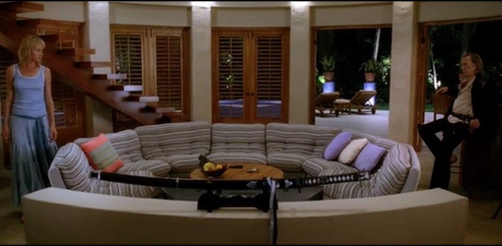
Director Stanley Kubrick is often referenced in discussions about symmetry in film, but in a very specific way. He utilizes symmetry to create unnatural and oftentimes uncomfortable frames (think about the hallway shots in The Shining). A similar effect is achieved in the living room frame from Kill Bill: Vol 2 seen above. The precision of the character’s exact separation creates a tangible sense of tension that is virtually impossible to ignore.
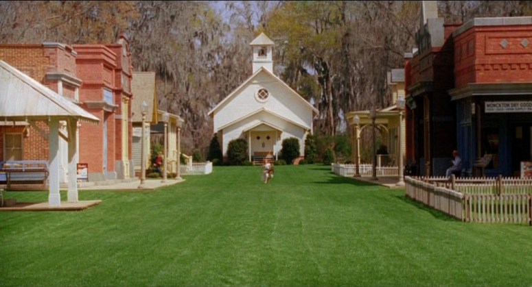
Anderson, on the other hand, uses symmetry for the complete opposite reason. Almost everything about the way he frames his shots, symmetrical or not, helps to create a storybook feel. The viewers are the intruders looking in on what might as well be paintings, a feeling further heightened by shots where the characters in the frame look directly at the camera, as seen in the above shot from Moonrise Kingdom.


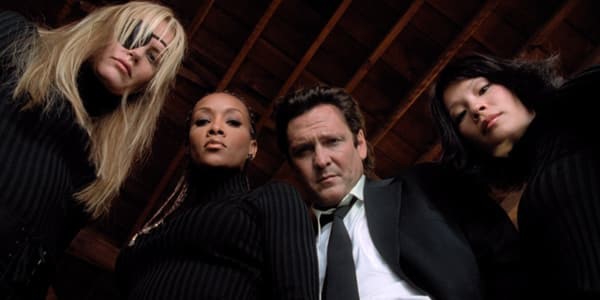
The overhead shot from Kill Bill: Vol 1 creates tension in a different way. Rather than showcasing the amount of empty space around or between key characters, this frame highlights the lack of space that currently exists around our protagonist. The symmetry and mirror images help to build the tension of a scene that already has us on the edge of our seats.
Tarantino is responsible for coining the specific shot seen below. Known as a ‘trunk shot’ they feature characters (usually two or three) opening something and looking down at the camera. It’s a creative angle that brings a unique perspective to the shot.
While Anderson doesn’t mimic the trunk shot exactly, he’s fond of a similar reveal: an item being suddenly moved or opened to reveal a group of characters looking directly at the camera.

Both directors also utilize wide angles, although Anderson more so than Tarantino. Wide angles help contribute to that painting-like quality I mentioned above in regards to Anderson. In the below frame from Moonrise Kingdom, Anderson pairs the wide angle and symmetry to create a rather haunting shot. This frame is an excellent example of building tension using the devices discussed above.


The above frame from Kill Bill is, in my opinion, one of the most beautiful shots from a Tarantino film. Whether it was the brain child of Tarantino or of DP Robert Richardson, I’m not sure. Whatever the case may be, it is a breathtaking frame in every way and not one that is easily forgotten.
So what do you think? Do the two directors utilize the same techniques to get different results?
Robert Richardson is the DP for all the Tarantino films referenced here, and Robert Yeoman is the DP for all of the Anderson films.
