I know I’ve mentioned before how often you start to notice something once you begin looking for it. It’s like the phenom of being told you have a lucky number or that a specific animal is representative of your spirit guide. Once your brain has identified that number/animal as noteworthy, it notices every one it sees. I feel the same way about visuals in film– once I start paying attention to specific frames, they start popping up all over the place. So here are some frames that I have noticed repetitively lately!
Focal Points
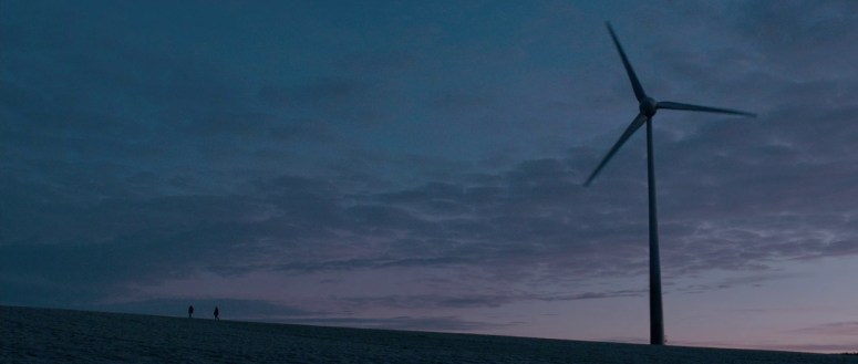
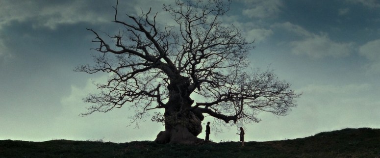
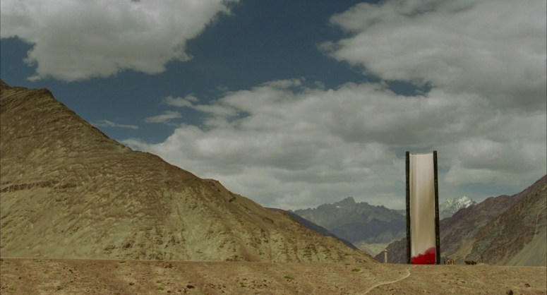
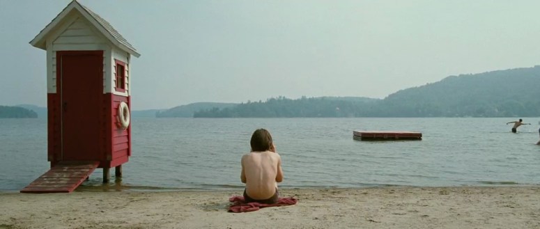
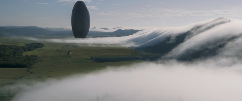
This first trio of frames isn’t quite as specific as the others I’ll be touching on, but it’s something that I have found to be so beautiful and grand. Intentional focal points are utilized in virtually every single movie, just on varying scales and to different degrees. The ones we’re taking a look at here are monument-sized and are impossible to ignore. The size of the objects could easily dominate the frame and detract from anything else that is happening, but the skill with which they were executed lends a feeling of imposing awe to the scenes that are taking place.
Byzantium (2012) || Sean Bobbitt (DP)The Deathly Hallows: Part Two (2011) || Eduardo Serra (DP)The Fall (2006) || Colin Watkinson (DP)
Peepholes
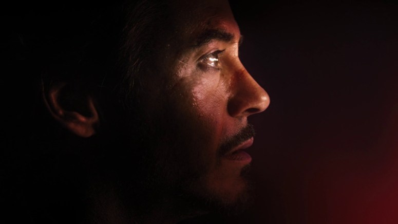
Perhaps one of the most iconic frames of all time, it would be heresy to talk about this technique without including the one that started it all: Norman Bates in Psycho. This moment has become rather common-place, which makes it all the more enjoyable when films offer a slight twist on it, as seen below via Iron Man’s mask in The Avengers.
Psycho (1960) || John L. Russell (DP)Hanna (2011) || Alwin H. Küchler (DP)The Avengers (2012) || Seamus McGarvey (DP)
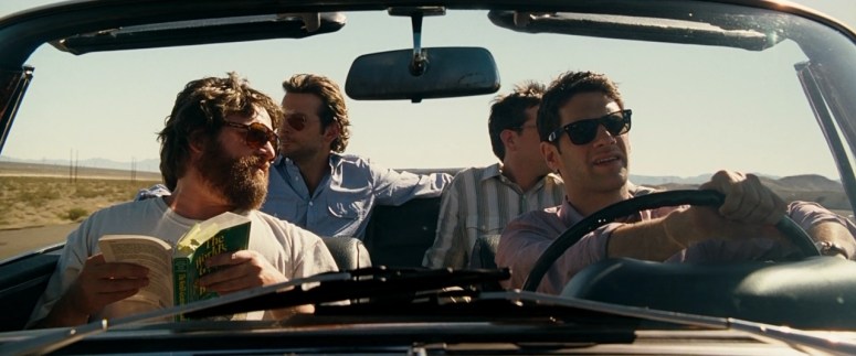
Windshields
Another common frame, this shot offers far less flexibility than the previous ones. A car is a car is a car, and a windshield really only affords so many options. The reason I enjoy this shot though is because of the instantaneous literal framework it provides. Whatever we already do or don’t know about the characters or the scene, the windshield frame acts as a picture frame, giving the viewer a look into a momentary tableau.
Safety Not Guaranteed (2012) || Benjamin Kasulke (DP)What’s Eating Gilbert Grape (1993) || Sven Nykvist (DP)The Hangover (2009) || Lawrence Sher (DP)
For some reason, this was a challenging post to put words to. I want to talk about how impressive a character can seem if they’re framed properly, about how tension between two characters can be tangible if they’re framed properly, and how groups can be so imposing if– you guessed it– they’re framed properly. But words are hard today, so let’s just jump right in!
I’m going to start with a few frames featuring solo characters. I think this is a largely underrated and unnoticed aspect of film that many viewers might not pick up on, but there is so much potential to character introductions, and it feels rare to see that full potential being met. For that reason, I wanted to start with my all-time favorite first appearance: the one and only Marla Singer.
The below frame is a stellar example of showing instead of telling. We don’t really know anything about Marla at this point, but the instant the camera turns to her, it’s impossible not be in awe.
Fight Club (1999) || Jeff Cronenweth (DP)
Straying away from first appearances, it probably comes as no surprise that I’m including a Donald McAlpine frame. The symmetry, shadows, and coloring of this character presentation all combine to work within the drama of the movie itself, and the tension of this particular scene.
Moulin Rouge (2002) || Donald McAlpine (DP)
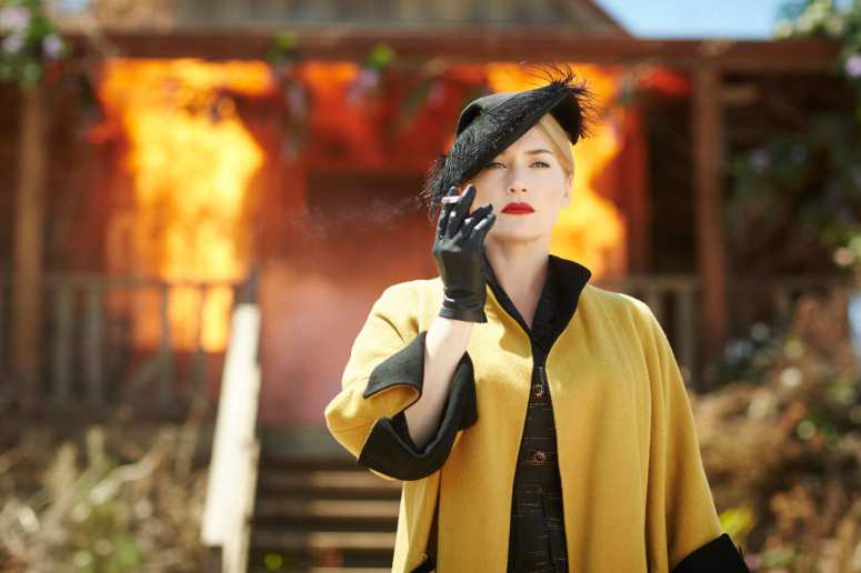
The visuals of a character walking away from a fire/explosion/burning building is an age old technique. We see it in westerns, in spy flicks, in super hero movies, etc. But rarely do we see it paired with a femme fatale garbed in handmade haute couture. And boy oh boy does it work. What a force to be reckoned with.
The Dressmaker (2015) || Donald McAlpine (DP)
Two people sharing a scene can run the gamut from stale to sensual. Characters can interact romantically, angrily, averagely, and so on and so forth. However, my favorite way for two people to share a frame is always when it’s charged with tension. This could be in a passionate way (a la cellblock tango in Chicago) or in a fearsome way (a la the xenomorph edging into a frame with a petrified Ellen Ripley).
The Handmaiden is an exquisite film, with every scene beautifully arranged and the characters perfectly positioned. But one of my very favorites moments was the one seen below. The repetition of the branches, the color juxtaposition of the costumes, and the locked eye contact all combine to create a tense and breathtaking scene.
The Handmaiden (2016) || Chung-hoon Chung (DP)
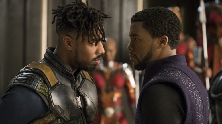
Speaking of tense, how about this faceoff from the recent Black Panther? The tension is tangible between the two royals as they size each other up and stare each other down. Largely thanks to the negative space and forceful eye contact, you can feel the heat between the two of them.
Black Panther (2018) || Rachel Morrison (DP)
It’s been a really long time since I’ve watched Hanna, and while I wasn’t over the moon for it back then, the final scene at the abandoned theme park has always stayed with me. This wide angle in particular is such a brilliant frame. Between the wolf head and the body language, the space between the two characters feels like a living thing, one Hanna is utterly determined to keep in existence.
Hanna (2011) || Alwin H. Küchler (DP)
Most of us have some sort of familiarity with standing in front of a large group of people. Either we are being watched, or we are doing the watching, and both carry with them their own sort of weight. It isn’t every day that a character is faced with a huge group of people on screen, which is part of why the below frames are so enjoyable.
In this frame from Tim Burton’s Alice in Wonderland, using Alice’s POV was a brilliant choice. Paired with the sea of white clothes and blankly expectant faces fading into the distance, you can almost feel the panic setting in.
Alice in Wonderland (2010) || Dariusz Wolski (DP)
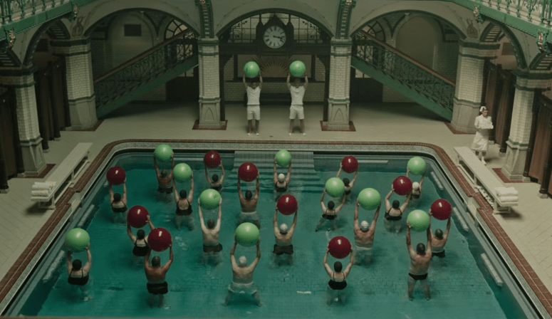
A Cure for Wellness is easily one of my most hated films. However, it is undeniably incredibly visually appealing. From start to finish, the movie focuses on repetition, reflections, and uncomfortable focal points to institute an undercurrent of unease. You can’t shake the feeling that something is off. This eerily centered frame is no exception. The color coordinated balls, the lines of the pool and staircases, and the razor sharp focus of the group in the pool combine to leave a tinge of discomfort with the viewer due to the unnatural perfection of it all.
A Cure for Wellness (2016) || Bojan Bazelli (DP)
While I wasn’t wild about the storyline, Girl Asleep (directed by Rosemary Myers) is another shockingly beautiful film. Based on the play of the same name, the film utilizes an almost constant feeling of being watched to inject tension and unease through the movie. Between the dark forest, characters in masks, mirrors, and clever framework during school scenes, you can feel the discomfort of our main character.
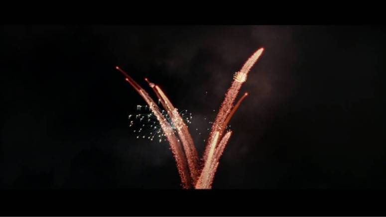
Now that my first round of color-centric cinematography posts is wrapped up, I wanted to pause and explore a couple of other themes. These seven frames all feature fireworks and sparks as a focal point. It’s exciting to see how such a variety of movies uses a similar item in a variety of ways for a variety of reasons.
Disclaimer: Thus far, I have only posted frames from films I’ve watched and that is a habit I have every intention of sticking to. However, the below frame from The Theory of Everything popped up on my dash and was such a perfect addition that I had to include it. This will be the very rare exception of including a frame that wasn’t hand-picked after a viewing.
The Man Who Cried (2000) || Sacha ViernyThe Theory of Everything (2014) || Benoit Delhomme (DP)Wonder Woman (2017) || Matthew JensenThe Great Gatsby (2013) || Simon Duggan (DP)Harry Potter and the Order of the Phoenix (2007) || Slawomir Idziak (DP)The Lord of the Rings: The Fellowship of the Ring (2001) || Andrew Lesnie (DP)V for Vendetta (2005) || Adrian Biddle (DP)
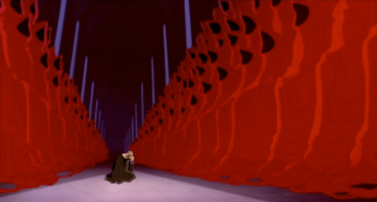
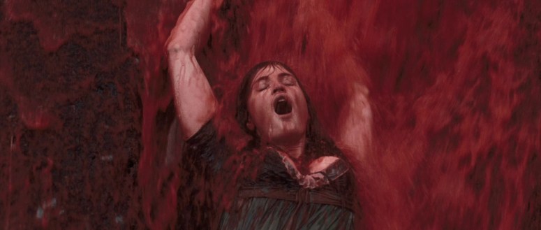
I’ve talked about the color red before, in regards to Tarantino and Anderson‘s use of it to drive home drama and importance. It’s an intense color that is visceral in a way no other color is. I’ve arranged these frames in order of presence/intensity, but I think all of them utilize the various shades in an amazing way. Enjoy!
The Hunchback of Notre Dame (1996) || Gary Trousdale (Director)Chicago (2002) || Dion Beebe (DP)Star Trek: Into Darkness (2013) || Dan Mindel (DP)Byzantium (2012) || Sean Bobbitt (DP)An American Werewolf in London (1981) || Robert Paynter (DP)We Need to Talk About Kevin (2011) || Seamus McGarvey (DP)Mr. Nobody (2009) || Christophe Beaucarne (DP)
I haven’t published a post about it yet, but as I mentioned in a previous post (and in just about every other place on this blog), I absolutely adore color in film. I love seeing how it functions as a plot device and how it sends subtle messages about what is happening onscreen. Color sets moods and drops hints and amps up aesthetics. To pay homage to my love for color in film, I’m kicking off a series of posts all about certain colors in certain frames. I won’t be talking much in these posts, but rather just letting the stills speak for themselves.
So without further ado, here’s seven shades of green.
Amélie (2001) || Bruno Delbonnel (DP)Batman Forever (1995) || Stephen Goldblatt (DPAmerican Fable (2016) || Wyatt Garfield (DP)Atonement (2007) || Seamus McGarvey (DP)Big Fish (2003) || Philippe Rousselot (DP)Hero (2002) | Christopher Doyle (DP)The Shining (1980) || John Alcott (Photographed By)
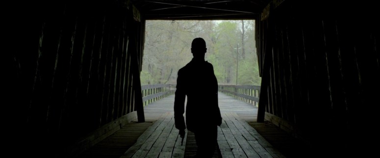
Oh the drama of a solid silhouette. Is there anything quite as commanding? They demand attention by drawing the eye to the subject, and often leave nothing else in the frame. Silhouettes define characters and situations, and are often used to emphasize the solitary nature of a single figure (a la Batman) or to amp up the drama of a group of people (a la Chicago‘s cellblock tango). Silhouettes help to elevate tension in an understated way by eliminating all the other details that would otherwise be vying for attention. It draws the focus to a pinpointed item or character and builds significance through isolation. They carry power through their simplicity– when you remove all the extra information, what is left is all the more commanding.
The Hateful Eight (2015) || Robert Richardson (DP)Harry Potter and the Deathly Hallows: Part Two (2011) || Eduardo Serra (DP)Lawless (2012) || Benoit Delhomme (DP)The Dark Knight (2008) Wally Pfister (DP)A Girl Walks Home Alone at Night (2014) || Lyle Vincent (DP)Django Unchained (2012) || Robert Richardson (DP)Bram Stoker’s Dracula (1992) || Michael Ballhaus (DP)
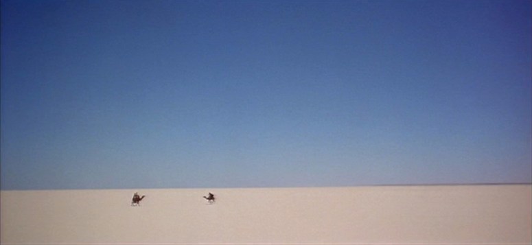
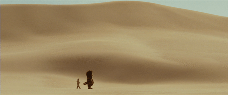
The use of expansive spaces on screen most often serves one of two purposes: to draw the eye towards something or someone, or to highlight the enormity (and sometimes hopelessness) of a specific situation. Expansive spaces can be used to highlight the hopelessness of a single person stumbling across an icy wasteland, or to emphasize a focal point of importance or beauty. Below, you can see some of my favorite frames that use skies and sand for one (or maybe even both) of the above purposes.
Lawrence of Arabia (1962) || Freddie Young (DP)Hero (2002) || Christopher Doyle (DP)Arrival (2016) || Bradford Young (DP)Skyfall (2012) || Roger Deakins (DP)
Mad Max: Fury Road (2015) || John Seale (DP)Prince of Egypt (1998) || Brenda Chapman (Director)The Fall (2006) || Colin Watkinson (DP)Where the Wild Things Are (2009) || Lance Acord (DP)
I’ll never forget the day I watched both volumes of Kill Bill and Moonrise Kingdom in the same night. I was introduced to Tarantino at an earlier age than I was Anderson, and have always been partial to Anderson due to my own affection for whimsy and quirkiness. But for some reason, I never made the connections between the stylistic choices of the two directors until the day I accidentally watched their films back to back.
Here’s my hypothesis: Anderson and Tarantino use the same techniques– color and symmetry– in similar ways to achieve different results.
Color
The colors that Anderson and Tarantino use are completely different, as are the moods they achieve with those colors. But both of them utilize color, both in entire palates and in specific spots, with a dedication that is not often seen. The thing about using color in film is that it isn’t always something viewers consciously pick up on (expect to see more on this in an upcoming post about color in film). The psychology of colors is a complex and extensive field of discussion, and there is no doubt that colors can both subtly and massively impact moods and feelings. Successfully utilizing certain colors to set certain moods is quite possibly one of the most clever ways to evoke feelings in film.
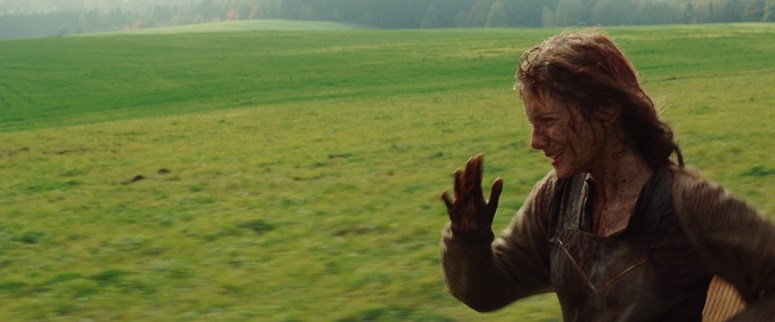
Tarantino uses primary colors such as red and blue in bold hues and cool tones to create emphasis on certain characters and contribute to the intensity of certain scenes. An excellent example of this is the use of the color red with Shosanna in Inglorious Basterds. When we first see her, she is running away with splashes of dark red blood on her face.
Inglourious Basterds (2009)
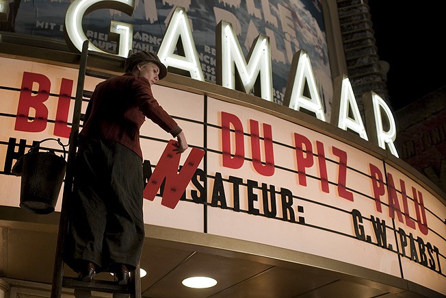
When we see her next, she is working on the marquis for her theater. There are bold red letters in the background and she is wearing a muted red jacket.
Inglourious Basterds (2009)
Her next scene features red as a significantly more dominant color: she is sitting in a bright red cafe booth and is surrounded by a vibrant shade of red.
Inglourious Basterds (2009)
And by the time we finally arrive at her climactic scene, she is draped, garbed, and surrounded by red.
Inglourious Basterds (2009)
The use of such a visceral and unavoidable color to slowly develop an incredibly strong and driven character is unmistakable. Tarantino’s most frequent use of red is with blood, but he often utilizes the color to evoke feelings of passion, violence, revenge, and intensity. Red is also known to enhance attention, both by drawing the eye to the color and by triggering certain feelings in the viewer. In the case of Shosanna, this works to drop increasingly more obvious hints that ‘this character is important, pay attention when she’s on screen.’
Anderson, on the other hand, uses it more often as an aesthetic focal point, while still hinting that something important is happening. An excellent example of this is with the narrator in Moonrise Kingdom. He’s simply talking about the weather, which is a very easy thing to zone out for. But by dressing him in a bright red coat and placing him in relatively colorless scenes, it helps the viewer to pay a bit more attention. Of course, anyone who has seen Moonrise Kingdom knows that the weather turns out to be a rather pivotal aspect of the entire storyline.
Moonrise Kingdom (2012)
A similar effect is achieved through the coloring of the tracksuits in The Royal Tenenbaums. It is impossible to not be drawn to those fire-engine-red outfits, which again hints that this is something important and the viewer should take note. In this case, it is quite possibly the clearest indicator of the arrested development that the three children experienced.
Royal Tenenbaums (2001)
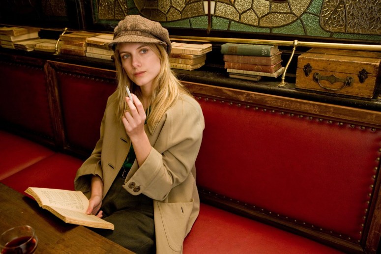
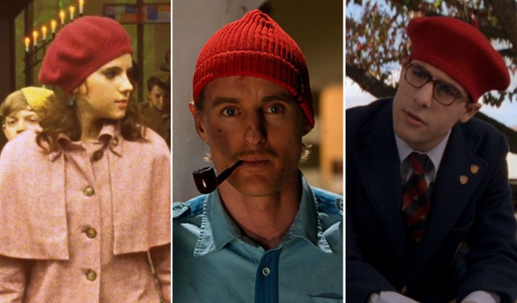
Anderson also plays up the passionate nature of the color red, using it to illustrate longing and deep desire, usually for affection. We can see this through the simple act of putting red hats on Suzy, Ned, and Max– all of which are desperate for the love of someone who is inaccessible in one way or another.
Suzy, Moonrise Kingdom — Ned, The Life Aquatic with Steve Zissou — Max, Rushmore
Symmetry
Over the years, Anderson has become known for his symmetry, and it is undoubtedly one of the primary characteristics of his stylistic choices. Tarantino seems to be a bit more partial to asymmetry, often choosing to follow the rule of thirds and offsetting a character to one side of the frame.
When I was watching Moonrise Kingdom minutes after finishing both Kill Bills, it was impossible not to notice the similarities between some of the frames.
Moonrise Kingdom (2012)Kill Bill: Volume 2 (2004)
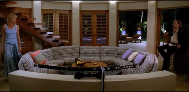
Director Stanley Kubrick is often referenced in discussions about symmetry in film, but in a very specific way. He utilizes symmetry to create unnatural and oftentimes uncomfortable frames (think about the hallway shots in The Shining). A similar effect is achieved in the living room frame from Kill Bill: Vol 2 seen above. The precision of the character’s exact separation creates a tangible sense of tension that is virtually impossible to ignore.
Anderson, on the other hand, uses symmetry for the complete opposite reason. Almost everything about the way he frames his shots, symmetrical or not, helps to create a storybook feel. The viewers are the intruders looking in on what might as well be paintings, a feeling further heightened by shots where the characters in the frame look directly at the camera, as seen in the above shot from Moonrise Kingdom.
Moonrise Kingdom (2012)Kill Bill: Volume 1 (2003)
The overhead shot from Kill Bill: Vol 1 creates tension in a different way. Rather than showcasing the amount of empty space around or between key characters, this frame highlights the lack of space that currently exists around our protagonist. The symmetry and mirror images help to build the tension of a scene that already has us on the edge of our seats.
Shot Lists
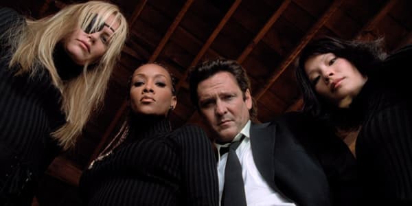
Tarantino is responsible for coining the specific shot seen below. Known as a ‘trunk shot’ they feature characters (usually two or three) opening something and looking down at the camera. It’s a creative angle that brings a unique perspective to the shot.
Kill Bill: Volume 1 (2003)
While Anderson doesn’t mimic the trunk shot exactly, he’s fond of a similar reveal: an item being suddenly moved or opened to reveal a group of characters looking directly at the camera.
Moonrise Kingdom (2012)
Both directors also utilize wide angles, although Anderson more so than Tarantino. Wide angles help contribute to that painting-like quality I mentioned above in regards to Anderson. In the below frame from Moonrise Kingdom, Anderson pairs the wide angle and symmetry to create a rather haunting shot. This frame is an excellent example of building tension using the devices discussed above.
Moonrise Kingdom (2012)Kill Bill: Volume 1 (2003)
The above frame from Kill Bill is, in my opinion, one of the most beautiful shots from a Tarantino film. Whether it was the brain child of Tarantino or of DP Robert Richardson, I’m not sure. Whatever the case may be, it is a breathtaking frame in every way and not one that is easily forgotten.
So what do you think? Do the two directors utilize the same techniques to get different results?
Robert Richardson is the DP for all the Tarantino films referenced here, and Robert Yeoman is the DP for all of the Anderson films.